Speakers and Panelists
Karen Cheng, "The Value of Visual Design in Scientific 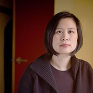 Communication"
From the moons of Saturn to the double helix of DNA, scientific discoveries from all ages are associated with memorable, iconic images. These images communicate in ways that text cannot, making difficult, complex concepts accessible. Discoveries today occur at an astonishing rate: scientific output doubles every nine years in approximately 24,000 scientific journals. Given this flood of information, first impressions count, and the overview figure is critical in shaping that first impression. At the University of Washington, our team sought to understand how visual design impacts the overview figure. Our team tested ten original and redesign figures with scientific readers. The results show that figures designed in accordance with classic visual principles significantly enhanced readers' first impressions of a paper. Improved figures made the associated papers seem more interesting, more clearly written, and more scientifically rigorous. These results confirm the value of visual design, and establish that aesthetic appeal enhances rather than detracts from the perception of intellectual and scientific competence.
Karen Cheng is professor of Visual Communication Design at the University of Washington, where she teaches information design and data visualization. Her research, which has been supported by grants from the National Science Foundation, examines how visual design can enhance functional and technical communications such as maps, forms, charts and diagrams. This research informs her professional design practice, which also focuses on making information both more understandable and more compelling in a wide variety of contexts—in print, in environmental installations and in interactive products.
 Farès el-Dahdah, "Temporal Cartography and the Visualization of Diverse Data"
This presentation will feature searchable digital atlases that illustrate the urban and architectural evolution of cities, as they existed and as they were previously imagined. Street views, aerial images, historical maps, and ground floor plans are located in both time and space while their visual and spatial data are integrated across a number of databases and servers, including a public repository of images, a geographic information system, an open-source relational database, and a content delivery web system. The relationship between the various project elements produces a web environment where vector, spatial, and raster data are simultaneously probed, toggled, viewed, and/or queried in a system that supports multiple expressions of diverse data sources.
Farès el-Dahdah received his undergraduate degrees in fine arts and in architecture from the Rhode Island School of Design and went on to pursue his graduate studies in urbanism and architectural theory at Harvard University's Graduate School of Design. Following a two decade long professorial track at Rice University's School of Architecture, he was appointed director of the Humanities Research Center in 2012 and Professor of the Humanities in 2014. With support from the Andrew W. Mellon Foundation, el-Dahdah co-led the 2015-16 John E. Sawyer Seminar on the Comparative Study of Cultures titled, Platforms of Knowledge in a Wide Web of Worlds: Production, Participation, and Politics and the 2016-17 Rice Seminar titled, Chronotopic Imaginaries: The City in Signs, Signals, and Scripts. This has led to his current research interests, which include the development online geospatial platforms that describe cities over time, as they existed and as they have come to be imagined.
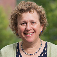 Alyssa Goodman, "glue-ing together the Universe"
Astronomy has long been a field reliant on visualization. First, it was literal visualization—looking at the Sky. Today, though, astronomers are faced with the daunting task of understanding gigantic digital images from across the electromagnetic spectrum and contextualizing them with hugely complex physics simulations, in order to make more sense of our Universe. In this talk, I will explain how new approaches to simultaneously exploring and explaining vast data sets allow astronomers—and other scientists—to make sense of what the data have to say, and to communicate what they learn, to each other and to the public. I will focus on the multi-dimensional linked-view data visualization environment known as “glue” (glueviz.org), explaining how it is being used in astronomy, medical imaging, and geographic information sciences. I will discuss its future potential to expand into all fields where diverse but related multi-dimensional data sets can be profitably analyzed together. Toward the aim of bringing the fruits of visualization to a broader audience, I will also introduce the new “10 Questions to Ask When Creating a Visualization” website, 10QViz.org.
Alyssa Goodman is the Robert Wheeler Wilson Professor of Applied Astronomy at Harvard University, co-Director for Science at the Radcliffe Institute for Advanced Study, and a Research Associate of the Smithsonian Institution. Her personal research presently focuses primarily on new ways to visualize and analyze the tremendous data volumes created by large and/or diverse astronomical surveys, and on improving our understanding of the structure of the Milky Way Galaxy. She is working closely with colleagues at the American Astronomical Society, helping to expand the use of the WorldWide Telescope program, in both research and in education.
Brian T. Jacobs, "Animated Science Graphics for a Digital Audience"
As a digital graphics editor, I create animated maps and graphics to tell visual stories about a wide range of scientific topics, for a general audience. I'll go behind the scenes of the design and development of some of these projects to detail process, and describe the techniques used to make experiences approachable and legible across the varying capabilities of the devices people use online. I'll break down the use of animation, where it can be successful, and where lessons from print inform where animation might not be helpful to understand concepts. Some of these projects were created with 3D graphics, rendered in browsers, in real-time. I'll talk about the role of 3D in visualizing and modeling scientific data, about the successes, challenges, and the approaches others have taken to visualize similar topics in alternate ways.
Brian T. Jacobs is a Senior Graphics Editor at National Geographic. He uses code, design, and visualization to express science topics to the public through interactive maps and graphics. He previously worked for the MIT Senseable City Lab in Singapore and was a Knight-Mozilla fellow at ProPublica in New York.
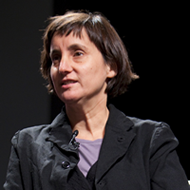 Laura Kurgan, "Cities full of data: developing critical perspectives on spatial research"
As a hub for interdisciplinary collaboration in spatial research, the Center links the work of the humanities with the fields of digital mapping, spatial data analysis, data visualization and design. Engaging in projects with civic and social orientations, as well as deploying an aesthetic project that treats big and small data as an urban resource, we map and visualize the complex and often invisible forces transforming cities today. Acknowledging the evolving features of this unruly terrain, our definition of spatial research treats cities and data as inextricably bound together. In order to understand cities historically and today, we cannot avoid engaging with data: it needs to be understood, harnessed, confronted, critically examined. Spatial research means getting deep into the data to find out what can be done and undone with it. We insist that the conditions of its production must be identified and defined, the ways it is collected or generated and distributed understood, and the feedback loop between what is generated as data and controlled by data scrutinized. What are the varying effects that data-based approaches to the city have had on cities themselves? And how can we deploy data-based approaches, and critiques of those approaches, to imagine alternative futures for cities?
Laura Kurgan is an Associate Professor of Architecture at the Graduate School of Architecture Planning and Preservation at Columbia University, where she directs the Center for Spatial Research and the Visual Studies curriculum. She is the author of Close Up at a Distance: Mapping, Technology, and Politics (Zone Books, 2013). Her work explores the ethics and politics of digital mapping and its technologies; the art, science and visualization of big and small data; and design environments for public engagement with maps and data. From 2004 - 2015, she founded and directed the Spatial Information Design Lab at GSAPP. The SIDL "Million Dollar Blocks" project is in the permanent collection of the Museum of Modern Art in New York City, and her work has also been shown at Palais De Tokyo and the Fondation Cartier in Paris, MACBa in Barcelona and the ZKM in Karlsruhe. In 2009, Kurgan was awarded a United States Artists Rockefeller Fellowship.
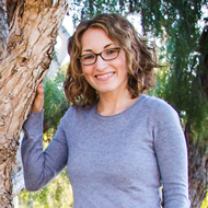 Mary O'Reilly, "Telling your story through illustration"
In order for scientific progress to move forward in a world inundated with information, researchers need to be able to communicate with each other within and across fields, and to the public, effectively and efficiently. A well thought out graphic can capture the attention and ultimately the understanding of an audience before losing their initial curiosity. As an added benefit, the process of creating an illustration often forces one to think about their model deeply, leading to new insights and even new experiments. However, the task may seem daunting when the researcher feels that they are not creative or artistic. In this talk, I will provide tips, techniques and resources for harnessing your own creativity, but will also discuss when it might be time to enlist a professional illustrator or designer, and what that looks like. I will also talk about creating journal covers, which is more about making an eye-catching piece of art than telling the whole story, but shares many similarities with the creative process of figure design.
Mary is a freelance science illustrator specializing in the chemical and biological sciences. Her work includes journal covers, slides, publication figures, website graphics, and animations for clients in academia and industry. She received her B.S. in chemistry from Purdue University, a Ph.D. in biological chemistry from MIT, and postdoctoral training at The Scripps Research Institute. Facing an uncertain job market in 2008 and 2009, she began to explore a lifelong dream of combining art and science. While teaching for three years as an adjunct assistant professor of chemistry and biochemistry at the University of San Diego, the illustration business grew into a full-time pursuit. She now lives and works in the Boston area.
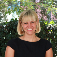 Kirsten L. Siebach, "Exploring Mars through the Eyes of Robots"
Our collective imagination has long been captivated by the surfaces of extraterrestrial worlds. Mars, as one of our closest planetary neighbors, has been the subject of speculation for millennia. As few as 55 years ago, when Mariner 4 successfully flew by Mars and sent back the first pictures of that planet taken from space even NASA was surprised by the presence of impact craters littering the surface. Today, Mars remains at least 34 million miles away, and human travel there is still futuristic, but it feels much closer because of the pictures robotic explorers send back of Martian landscapes that appear eerily familiar. As scientists, these photos of the deserted Martian landscape provide our best opportunity to compare and contrast the geologic processes that happen on Earth with any other world—both those happening today and those in the ancient past. As new technologies allow us to virtually “walk on Mars” through the eyes of rovers, we gain new opportunities to learn what it is that makes our own planet so unique. I will describe how we use new visualization technologies to drive rovers to explore the surface of Mars and learn about its active geologic past.
Kirsten L. Siebach is Assistant Professor in the Rice University Department of Earth, Environmental, and Planetary Sciences. Her work focuses on understanding the history of water interacting with sediments on Mars and early Earth through analysis of sedimentary rock textures and chemistry. She is currently a member of the Science and Operations Teams for the Mars Exploration Rovers and the Mars Science Laboratory. Kirsten completed her PhD in Geology at Caltech with Professor John Grotzinger with a dissertation titled “Formation and Diagenesis of Sedimentary Rocks in Gale Crater, Mars”, and then did postdoctoral research in geochemistry of Martian sediments with Professor Scott McLennan at Stony Brook University. Prior to Caltech, she attended Washington University in St. Louis, where she worked with Professor Ray Arvidson and graduated summa cum laude with a B.A. in Earth & Planetary Science and Chemistry.
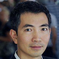 Bang Wong, "Visual approaches to exploring and explaining data"
Researchers today have access to an unprecedented amount of data. The challenge is to benefit from this abundance without being overwhelmed. Data visualization for efficient exploration and effective communication is integral to scientific progress. Each goal entails different approaches to data representation, but sound graphic design principles are important in both. Despite the importance and widespread use of visualizations, we primarily rely on our intuition, common sense and precedent in published material when creating them – a largely unscientific process. This presentation will focus on data visualization techniques informed by human perception and cognitive psychology intended to support data exploration and explanations.
Bang Wong is the creative director of the Broad Institute of MIT and Harvard and a faculty member in the Department of Art as Applied to Medicine at the Johns Hopkins University School of Medicine. His work focuses on developing data visualization methods and techniques to explore and explain a variety of biomedical research data. He has written extensively about the fundamental aspects of visual representation and is the founding author of the 'Points of View' series of articles published by Nature Methods. Bang is a National Academy of Sciences Kavli Fellow and the Samson Feldman Visiting Scholar at Johns Hopkins.
Demonstration Instructors
 Alyssa Goodman, Linked exploratory data visualization using Glue
glue is a Python library to explore relationships within and between related datasets. With glue, users can create scatter plots, histograms and images (2D and 3D) of their data. glue is focused on the brushing and linking paradigm, where selections in any graph propagate to all others. glue uses the logical links that exist between different data sets to overlay visualizations of different data, and to propagate selections across data sets. These links are specified by the user, and are arbitrarily flexible glue is written in Python, and built on top of its standard scientific libraries (i.e., Numpy, Matplotlib, Scipy). Users can easily integrate their own python code for data input, cleaning, and analysis. glue is a multi-disciplinary tool, designed from the ground up to be applicable to a wide variety of data. Today, glue is being used extensively in astronomy data and in the analysis of medical images.
Alyssa Goodman is the Robert Wheeler Wilson Professor of Applied Astronomy at Harvard University, and a Research Associate of the Smithsonian Institution.
 Hadley Wickham, Visualisation with ggplot2
In this hands on tutorial, I'll show you the basics of visualisation your data with ggplot2. You'll learn practical tools to create the most important statistical graphics like scatterplots and histograms. You'll also learn about the rich theory that underlies ggplot2: the grammar of graphics. This will help you to continue to build on what you learn in this class, and over time create graphics specifically tailored for the problem at hand. ggplot2 is part of the tidyverse, a collection of R packages designed to make data science as easy as possible. I'll also touch on some of the other most important tidyverse packages: readr for reading your data from disk, tidyr for reshaping data into a form amenable to analysis, and dplyr for summarising and manipulating your data.
Hadley is Chief Scientist at RStudio, a member of the R Foundation, and Adjunct Professor at Stanford University and the University of Auckland. He builds tools (both computational and cognitive) to make data science easier, faster, and more fun. His work includes packages for data science (the tidyverse: including ggplot2, dplyr, tidyr, purrr, and readr) and principled software development (roxygen2, testthat, devtools). He is also a writer, educator, and speaker promoting the use of R for data science. Learn more on his website, http://hadley.nz.
